Design Brief, Logo and Branding
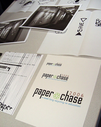
Students worked to produce an eye catching logo with a catchy tag line that marketed the message of the paper conservation week effectively. Borrowing from television and literature, the students decided on "Paper Chase" with the tag line of "a week-long recycling re-education plan." Colors were chosen based on successful methods of "green" marketing: the universal global tones of blue, brown and green. Still keeping a slick contemporary look with the typography, the logo was not too rustic. The colors chosen gently symbolize the sky, earth and nature.

It was absolutely mandatory that once decided upon, all aspects of Paper Chase had to strictly follow the logo and branding to consistently deliver the project message and ideas.
posted by Merry-Beth Noble @ 9:21 AM
![]()

0 Comments:
Post a Comment
<< Home